Visual readability has been a personal bugbear throughout my time in video games. There’s been some cases where I’ve been really happy with the choices I’ve made, and others where I feel I could have done much better. From my point of view, visual design is only partly about making things look pretty. It is primarily about conveying information that the player needs in order to interact.
Where are the key objects in the scene? What do they do? What can I interact with? How can I interact with it? What is my goal? What should I aim to avoid? Once those questions have been answered, then the developer is free to answer the question “how should I feel about this scene?”

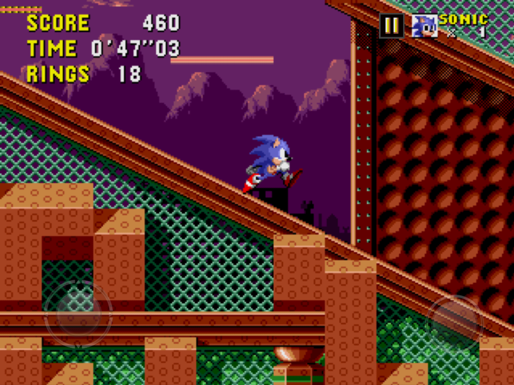
The original Sonic the Hedgehog is visually outstanding not just because it presents landscapes that feel rich, vivid and fleshed out, but also because it has a very strong grasp on delivering key information. I’ve always admired, for example, the fact that Sonic when rolling is the exact same shape as his hit-box
Sonic the Hedgehog conveys its information not just through the shape and form of its visual elements, but also by its use of colour. That’s what makes it an exciting example I want to explore in this article.
Conveying Geography
The player needs to be able to pick out which bits of the level Sonic can stand on, which are walls he can push up against, and which are objects that he can smash through. Given that this is a platform-jumping game, conveying to the player what Sonic can stand on is of utmost importance.

A change of hue can be used to pick out the difference between foreground and background. In the screenshot above, taken in Scrap Brain Act 1, there are a lot of blue tones in the foreground and red tones in the background. Similarly we see that ground which Sonic can stand on has drop-shadows. The shading in the background is much more indistinct. The eye reads this foreground instantly as three-dimensional and solid.
By contrast, details in the background are either in low contrast with their surroundings, or have mottled, dotted textures to them. They are readable but they do not jump out to the player as important details or solid objects.

As well as the difference in hue between foreground and background, we also see a separation between light and dark. In this image from Scrap Brain Act 2, the background colours all seem to lie in the 0%-50% band of lightness, while the foreground elements lie in the 70%-100% band. What impresses me about this technique is how the eye does not pick this out as being inconsistent. It does not feel that the background belongs to a separate room. The two layers are consistent with themselves, and that is enough for it not to feel visually messy.
Take a look at the button as well. It is light grey on the top, in the centre and on the sides. This may not be realistic - where is that button being lit from? - but it doesn’t matter. First and foremost this use of colour conveys that the button can be collided with and is solid.

Again, we see a strong three-dimensional effect applied to the blocks in the foreground. They also have a flat white line on their top edge. It makes it stand out as a key foreground element but also, by being flat, conveys that this is an object which can be stood on.
The green metal reflects a difference between these blocks and the terrain around them - that the blocks move. It reinforces to the player that these platforms obey different rules to the scenery around them. Differences in hue can also be used to convey differences in purpose.
Here’s an example of the visual rules being tweaked or broken, and where I feel the game manages to get away with it. There’s a light edge on this vertical wall, in a game where light edges on flat surfaces are usually collidable. Fortunately there’s plenty of detail reinforcing the idea that this is a background element - the block shadow lying on it sets it into the background, and there’s nowhere else in the game where a slope meets a wall like this. I’m not entirely sure what would happen to Sonic’s momentum if there was one.
In addition there’s no stage hazards on screen at the same time, so it’s a safe space to break the rules. The benefit here is that the scene does pop visually as a result of the contrast, and it reflects the metal-clad industrial feel of the area. Perhaps the lesson here is that it’s okay to break one’s own rules in favour of aesthetic feel when it does not create a danger for the player.
One could make the same point about the previous images. Flashing white lights behind the rings draw a lot of attention, but this doesn't impede the player as the area is not dangerous. It's okay for the visuals to be extravagant.

Again, reflecting on the use of straight edges of light, the pillars here have straight light lines running down them but they’re on the inside of the shape so they do not appear solid. What they do however appear as is loud.
They are far brighter and more attention-grabbing than the button on the left-hand side, which is grey, more dim, but is actually interactive. Personally, I don’t think this is a good bit of visual design. Better for this to be an individual area than a recurring visual theme.
Indeed, by contrast to these pillars the "Roller" enemy on Sonic's left barely stands out. This is one area where key information is washed out by busy scenery

I also don’t like the design of the “Spikes” enemies. Their magenta colour scheme blends them right in with the background. They are one of few enemies in the game that cannot be defeated from any angle, but the spikes growing out of its back aren't large or consistent enough to convey genuine danger.
Moving Underwater

Labyrinth Zone is interesting because it has two colour schemes: one for above the water and one for under it. On the surface there is little difference in hue between foreground and background, but there is a difference in brightness. Notice how the contrast between light and shadow is much more pronounced in the foreground. Details in the background are small, delicate and mottled, while in the foreground details are boldly three-dimensional. There is a clear separation of layers conveying purpose and depth.
All collidable terrain has, just like in Scrap Brain, a one-pixel-thin edge around it, making it easy to pick out exactly where Sonic can and can not go. Vines dropping down from above are not collidable, and this is drawn by having them thin and spindly, drawn mostly in cyan mid-tones. They are not loud.

By comparison, the difference between background and foreground while underwater is much more pronounced. The background uses blue hues while the foreground uses green hues. You’ll also notice that the distortion effect is much more pronounced in the background than the foreground, making it feel less solid.
It's really important that the landscape be readable while underwater, while the player’s movement is impaired.
But if differentiation between landscape and decoration is always useful, why not have high contrast above the water too? Perhaps there is a limit to how necessary this differentiation is, and in some cases the contrast can be pushed higher but the effect is sufficient. The payoff that Labyrinth Zone affords itself by having weaker contrast above the surface is a sense of tone. The darker backdrop underwater conveys deep dark danger, and the green stone conveys mystery and unease. By contrast, the surface feels warm, well lit and safe.
We can make a direct comparison with the same zone as represented on the Sega Master System.


With the stark contrast between golden stone and a black backdrop the surface feels imposing and treacherous, while underwater feels murky but sedate. Escaping to the surface feels like a return to light but not a return to safety. The visual design runs counter to the feel of the level, where being underwater is dangerous and the player desires to return to the surface.
Using White
There’s a wonderful visual trend in Sonic the Hedgehog - that every interactive object has white somewhere in its sprite. By contrast, it is rare that scenery uses the colour white.
Sonic has white in his eyes, or reflecting off him if he is a ball. Collectable rings have white light glinting off them. So do item boxes. Enemy robots do too. It's a very subtle effect, but it helps the eye pick out key bits of scenery at a glance.

Where it's really noticeable is while underwater. When all the other colours on the screen have turned green and blue, white highlights stay white. It may not be visually realistic, but it conveys super-important information. Sonic runs, jumps and falls at a much slower pace when submerged. The player is likely to be on the back foot, but also needs to be able to plan jumps in advance, anticipating where hazards will be by the time Sonic lands.
If key information is within instant grasp, the player can make these decisions while well informed, rather than feeling caught out.

Sonic gives you the ability to move very fast, but the level design in the first Sonic game is largely not about moving very fast. Sonic often has to stop, think, and time jumps. He also has to react. There are spaces where you can run at full pelt but where you will need to respond quickly, by slowing down or by jumping. Sonic is invincible to most enemies when jumping, so the game is less concerned with your accuracy in disposing of a hazard than the fact that you recognised it and responded.
That’s why it’s important to see everything at a glance. If you’re moving quickly and something interactive pops into your view you need to see it and evaluate your reaction. Jump into it? Jump over it? Stop and wait for it?

That said, the game is not perfect. The fireballs shown above are some of the most annoying hazards in the game. They're small and their colouring isn't bright enough to pick out from the scenery, unless you already know where they are. The power of the use of white is made obvious by its absence.
Colouring Sonic
I often talk about "hot and cold" when considering video game graphics. Saturated colours, bold contrasts and busy textures draw the eye - I refer to this as hot. Grey tones, low contrast and mottled textures recede - I call this cold. It's important that the game draws the eye to the information that is most useful.
I find it interesting that in the very first Sonic game, the main character - Sonic the Hedgehog himself - is not rendered particularly hot. His colour scheme seems to gravitate to blue mid-tones, which are often quieter than the objects in the level around him. Aside from the whites of his eyes, Sonic as a character does not leap off the screen at you. He does not make his location resoundingly obvious.
Sonic is almost always at centre-screen, which means it’s far less important to highlight where he is. The player is much better equipped to locate him by where the centre of the screen is. Perhaps having a bright bold object at centre-screen through most of the game would create an unnecessary focal point. If the player knows that Sonic is at centre screen then what they need to know is where the hazards are. That information is both new and pressing.

In boss arenas Sonic can move freely with the camera fixing itself in the centre of the arena. There are fewer visual elements for the player’s eye to track here, and new information is not being introduced from off-camera like it would be during the level.
It is perhaps for this reason that the designers of Spring Yard Zone felt confident putting a visually complicated background in the boss arena. The bushes in the background have a loud pattern described with high contrast tones. It’s stimulating to look at but visually complicated, drowning out the key information: Sonic, Robotnik, and the crumbling floor beneath them.
To its credit, it is a visual choice that is dramatic at a point in the game which benefits from drama. It may be complicated, but better to have this as distinct moment at the zone’s climax, rather than a recurring motif throughout the level.
Evolving Sonic's Colours
I feel the relevance of these ideas is important when looking at the trailers for Sonic Mania: an upcoming Sonic the Hedgehog game created in the style of the classic Mega Drive titles. I’m interested in the game, but in all honesty a little worried at first glance. The game looks far too noisy.
It looks like artwork designed to impress, to pop out of the screen. But is it well-designed for spacial awareness?
I may be wrong on this. I said similar things about trailers for Street Fighter V and felt completely different when I played the game first-hand. Nevertheless, it continues a trend that has already existed in the Sonic series. From Sonic 1, to Sonic 2, to Sonic 3 & Knuckles, the colours in the game have got bolder and more saturated, while the level artwork has got more detailed.
 |
| Knuckles Choatix for the Sega 32X |
Knuckles Chaotix, released in 1995 for the 32X add-on system, is a successor to these games. That is, it is next in the sequence of 16-bit 2D pixel-art Sonic games. It looks visually messy, and in places is barely navigable. All the colours are bright and loud and level details are fiddly. There is no visual differentiation between key gameplay elements and set dressing. Every single object in the frame is hot.
Knuckles Chaotix is drawn this way because it needed to make Sega’s 32X system look more powerful. Bold artwork conveys power.
Each successive Sonic game has been driven to look more powerful than the one that came before it - even if the technology driving the sprite-based artwork was barely changing. In a time before polygon counts created a metric for visual quality that could always be increased, the developers were limited in how to convey that this game's graphics were "better" at a glance.
The developers’ only tool to convey "better" at a glance was bolder sprite work: more saturation, more detail, darker shadows.
Today’s developers of Sonic Mania are faced with the same problem - they must justify using the present day’s more powerful consoles for a pixel-based game. The graphics must impress, but they must also adhere to the house style of the early 1990s - it's the game's USP.
 |
| Sonic Advance on Game Boy Advance |
What Graphics Are For
I personally feel that the first purpose of graphics is to convey information, and the second is to convey tone and personality. Looking impressive is of limited benefit to the moment-to-moment experience. Only by conveying information well can the the player experience the game seamlessly and appreciate its tone. Additionally, tone and personality will stick with a player far longer than initial "wow" factor.
However, making a strong pitch to customers is a business reality, so to impress is a necessity. Any creative team who manages to capture all of the above is performing outstanding work.
Nevertheless if there’s anything I want to convey in this article it’s the following: always know what your players see, and what they need to see. Be clear with yourself about what’s essential information, and how the pace of your game affects what needs to be clearest. Colour is rich and powerful tool for this very purpose.